Charts
Charts, graphs, and maps.
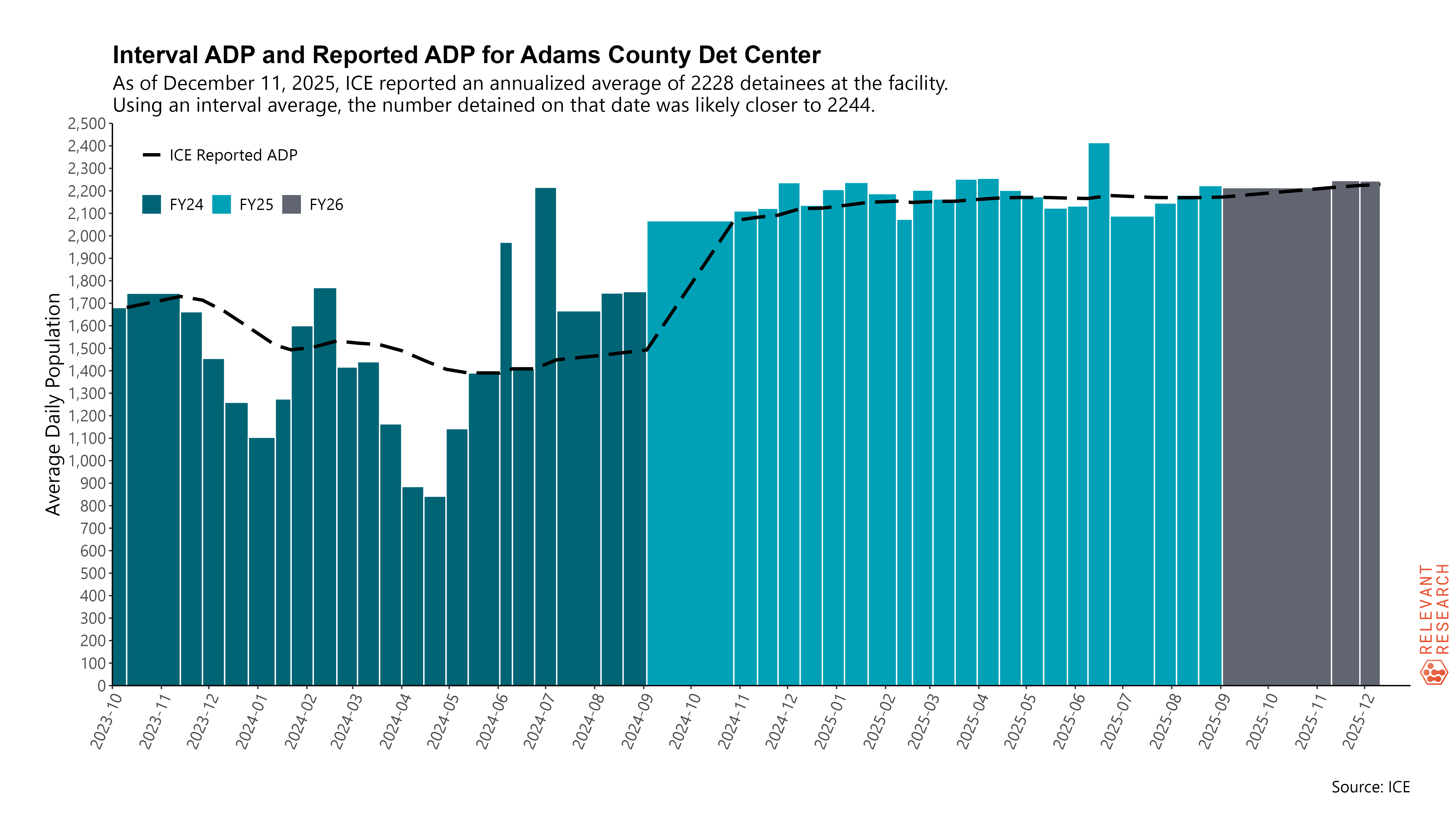
From DetentionReports.com.
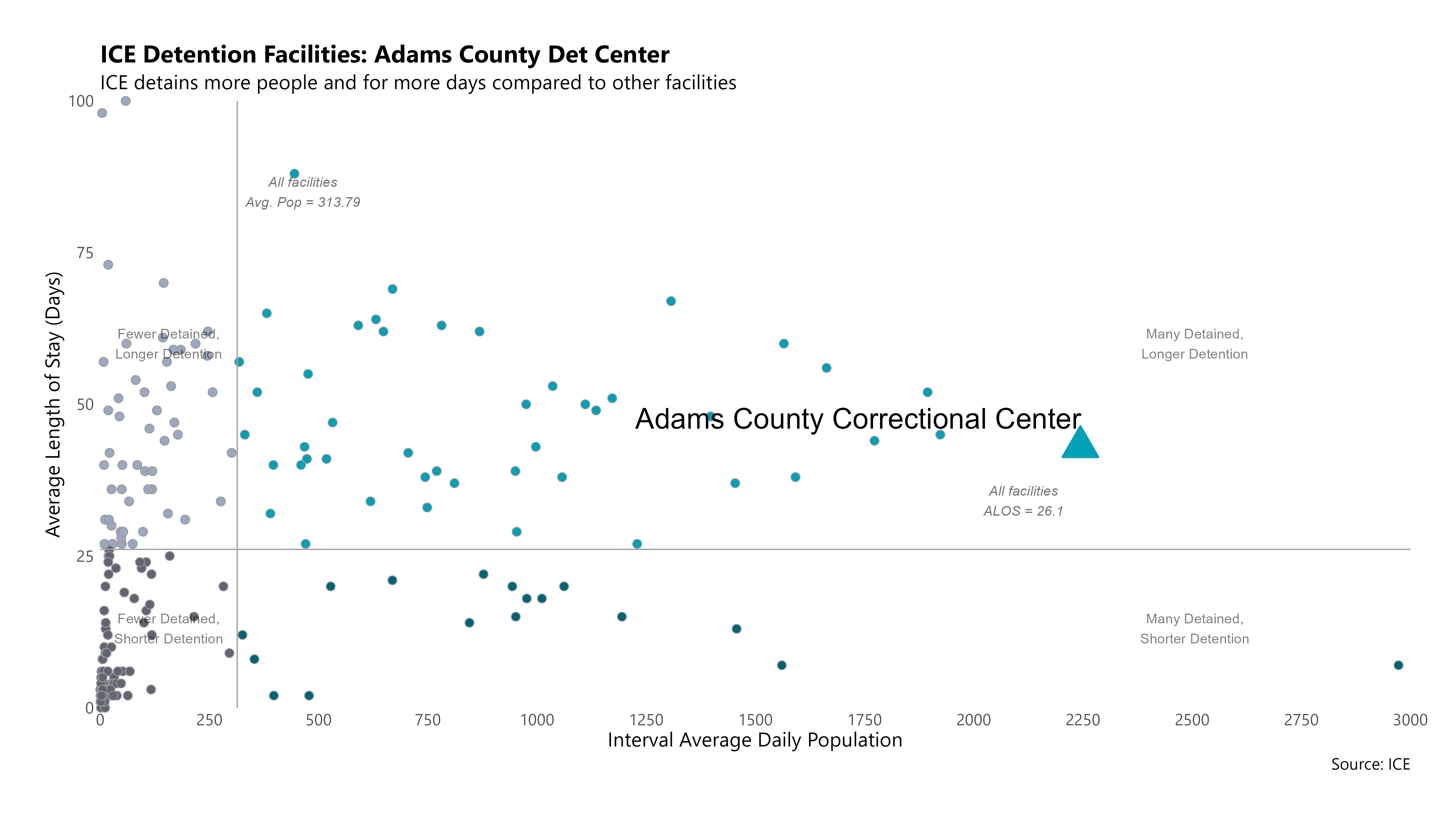
From DetentionReports.com.
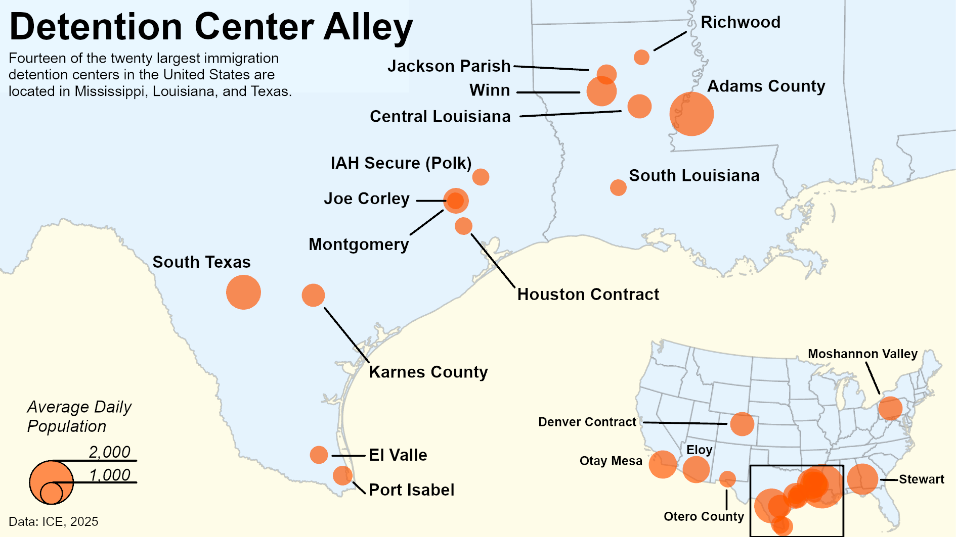
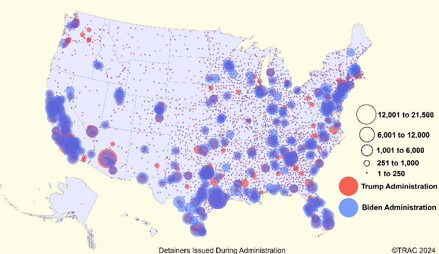
From this Immigration report by TRAC.
From this Immigration report by TRAC.
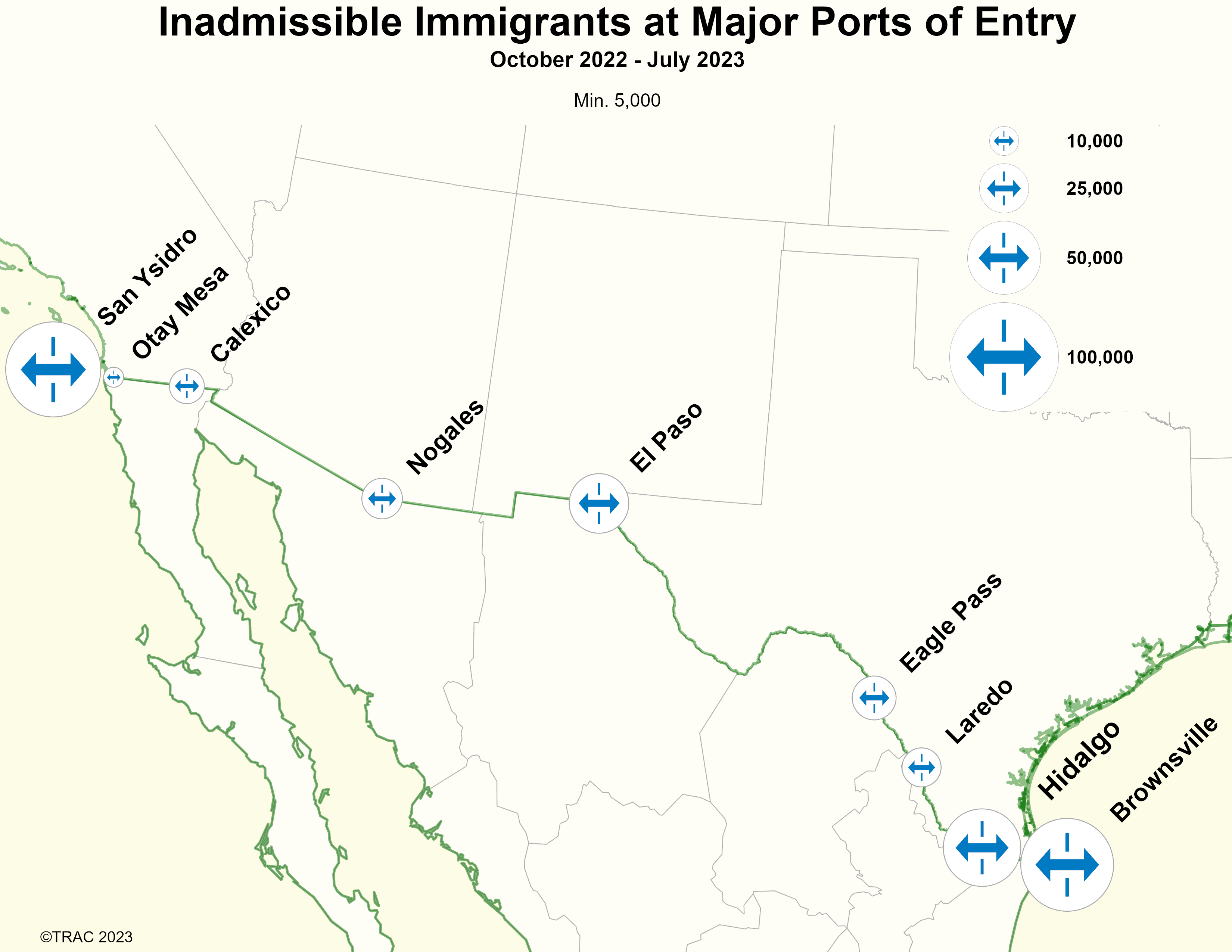
From this Immigration report by TRAC.
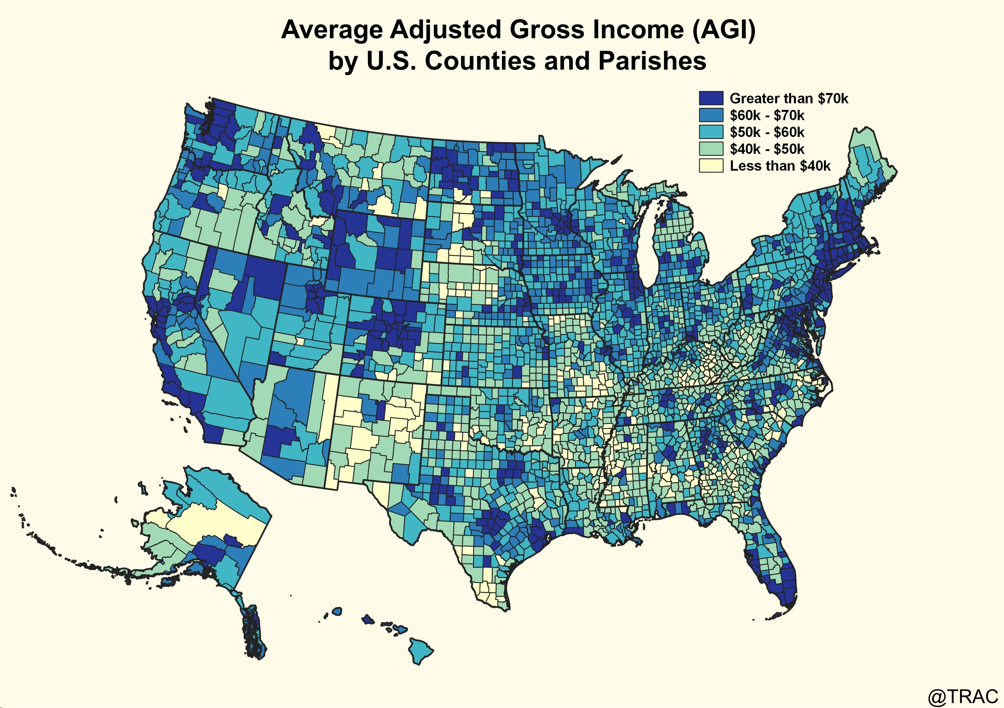
From this IRS report by TRAC.
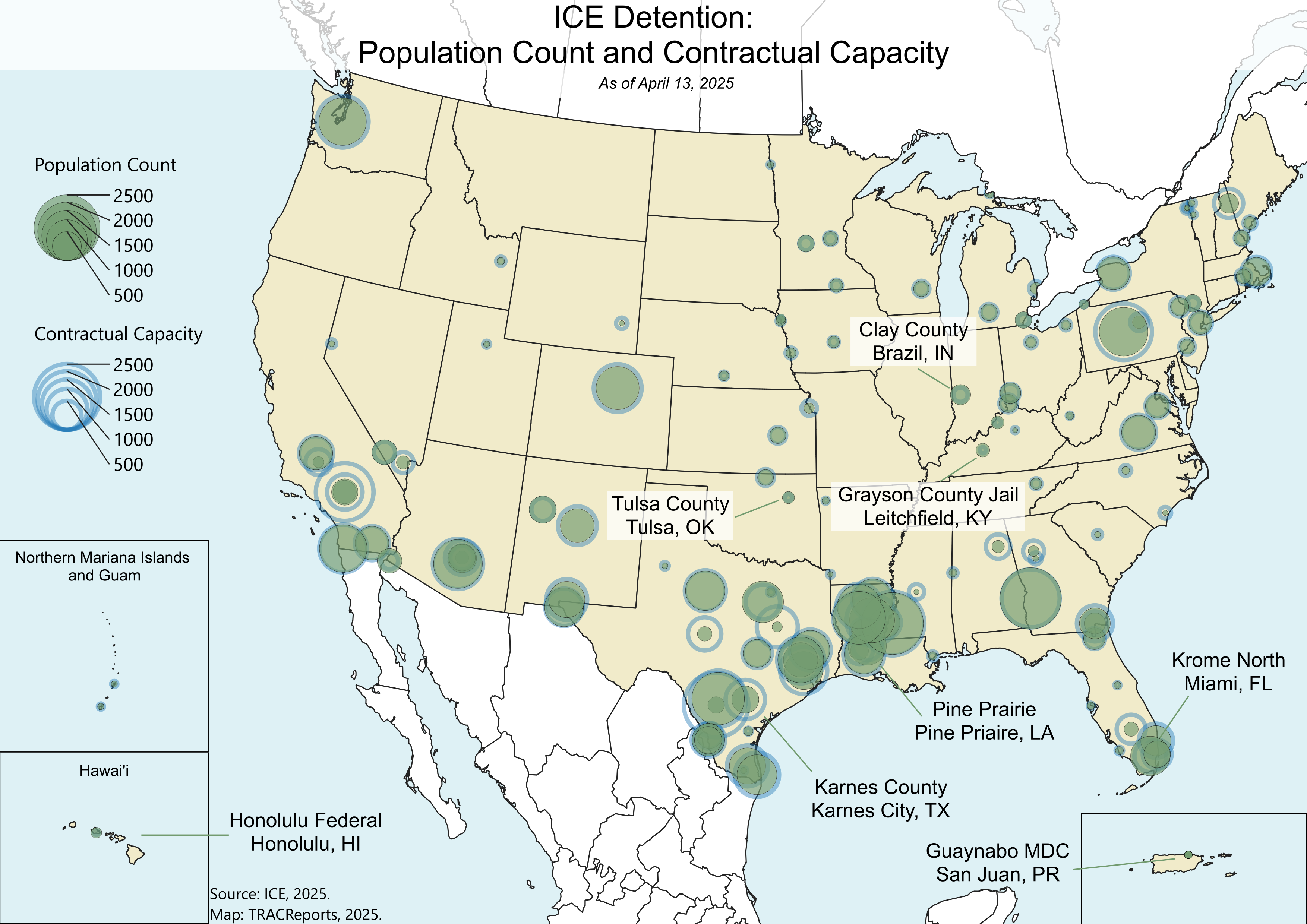
From this Immigration report by TRAC.
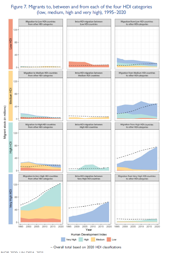
From Chapter 7 of the World Migration Report 2020.